HTML/CSS - 1
Contents
Learning Objectives
Learning objectives for this lesson can be found on the Learning Objectives page
HTML/CSS Project
In today's class, we will begin adapting styles on the Bikes for Refugees project. We'll review some of the HTML/CSS basics you already encountered during your application process and learn some new concepts. Fork the repository to your personal account and then clone the repository.
Who uses the web?
As a group, let's think of everyone that uses the web.
- What kinds of people use the web?
- How might their experiences be different?
As web developers, we don't build websites for ourselves—we build them for our users. Therefore, it is our responsibility to build websites that can be used by all users of the web. These include:
- Users that are blind or have low vision
- Users that are colourblind
- Users with mobility impairment
- Users that are deaf or have hearing loss
To aid using the web, these users might use assistive technologies. These include:
- Screen readers, which is software that reads out content on the screen to the user.
- Screen magnification software, which enlarges the content on the screen for the user to see better.
- Speech input software, which allows the user to perform commands using their voice instead of a mouse and keyboard.
Creating accessible websites is important for users with disabilities and users that use assistive technologies so they can access the same content as able-bodied users. This is especially important when the website provides an essential service, such as one through a government website. In this module, we will learn some of the ways to make websites accessible.
What makes a web page?
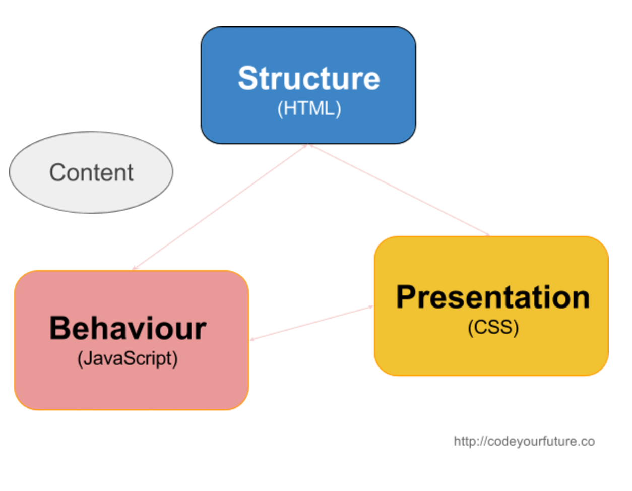
A web page consists of three programming languages: HTML, CSS, and JavaScript. They define the structure (HTML), presentation (CSS), and behaviour (JavaScript) of the page.
Separation of Concerns: In computer science, separation of concerns (SoC) is a design principle for separating a computer program into distinct sections, such that each section addresses a separate concern. (Wikipedia)
Principles: During the course, we will highlight principles that apply to the specific topic but also to Computer Science and Programming in general. It is important to understand these principles, terms and apply them to your thinking in general.
In the Bikes for Refugees project, spend a few minutes exploring the .html and .css files.
Why don't we put everything in one file?
What is HTML?
HTML (HyperText Markup Language) is the language used to create documents that are displayed on web browsers.
It gives structure and meaning to content by using tags such as <h1> and <p> to describe headings and paragraphs of text.
HTML Anatomy
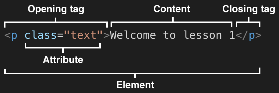
An HTML element is made up of tags, attributes, and content.
- A tag is the HTML element name enclosed in angle brackets
<p>is the opening tag</p>is the closing tag
- An attribute comes after the HTML element name within the angle brackets
class="text"is the attributeclassis the attribute nametextis the attribute value
- The content is the part of the code in between the opening and closing tags
Welcome to lesson 1is the content
All together, let's review the basic syntax in the following example.
Which parts are the elements, tags, attributes, and content?
<article>
  <h1>Learning HTML</h1>
  <p>Get to know the HTML basics.</p>
  <a href="http://html5rocks.com">Read Article</a>
</article>
HTML Structure
Every HTML document has the same base structure, shown in the code example below.
<!DOCTYPE html>
<html lang="en">
  <head>
    <meta charset="UTF-8" />
    <title>My web page</title>
  </head>

  <body>
    <article>
      <h1>Learning HTML</h1>
      <p>Get to know the HTML basics.</p>
      <a href="http://html5rocks.com">Read Article</a>
    </article>
  </body>
</html>
The html element declares that it is an HTML document, and contains a head and body element.
- The
headcontains data about the web page, such as the name of the page (My web page) and the text encoding (UTF-8). - The
bodycontains the content which is shown in the browser.
HTML tags are arranged in a hierarchy. This is sometimes called nesting tags or creating an HTML tree. Between the opening <article> tag and the closing </article> tag there are three other tags. We call these child tags, because they have a parent-child relationship.

As a group, let's try to name all of the parent and child tags in the following example.
<article>
  <h1>Learning HTML</h1>
  <p>
    <span class="author">Author:</span>
    <a href="http://codeyourfuture.io">Code Your Future</a>
  </p>
  <p>Get to know the HTML basics.</p>
  <a href="http://html5rocks.com">Read Article</a>
</article>
Semantic HTML
Semantic HTML is the use of HTML markup to reinforce the semantics, or meaning, of the information in webpages and web applications rather than merely to define its presentation or look. Wikipedia
When writing HTML code, we can use different tags to describe the content. Is it a navigation menu, a paragraph of text, or an article? By using the correct tag, we help search engines like Google or screen readers for the visually impaired understand the content better.
When possible, we should use semantic HTML instead of generic HTML like <div> and <span>.
The following four sections cover different types of semantic HTML we can use.
If you want to view all semantic HTML elements, visit the MDN HTML elements reference page.
When creating a web page, we should always think about how to structure the content using semantic HTML first, then think about the styling afterwards.
Sectioning Content
We can put groups of content that make up areas of a web page inside 'sectioning' elements. These split the page up into named sections that help to organise the page's structure.
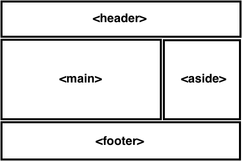
The image above shows a common layout of a web page. We can use specific HTML elements for each of these sections.
- We can use a
<header>element for the header content - We can use a
<footer>element for the footer content - We can use a
<main>element for the main content of the page - Sidebar content can go inside an
<aside>element - If there is a list of links, for example within the
<header>of a page, they can go inside a<nav>element
Additionally, we can use <article> and <section> to divide these sections into more sections.
Use these sectioning HTML elements in every website you build. This lets screen reader users jump to these sections of the website quickly.
Text Content
For text we mainly use these block and inline elements.
<h1>to<h6>for headings- There should be only one
<h1>element on the page, and we shouldn't skip levels
- There should be only one
<p>for paragraphs of text<ul>and<ol>for lists<ul>, unordered list for items not in any particular order<ol>, ordered list for lists where the order matters
<em>for emphasis<strong>to indicate importance, seriousness or urgency
Image Content
We can use <img> to display images on our page.
Every <img> element must have an alt attribute which describes the image.
This is important so that if the image does not load or if the user is using a screen reader, users can still understand the image content.
If the image is not important because it is only for decoration, we can provide an empty alt (alt="") to indicate this.
<!-- Image with a description -->
<img src="sleepy-cat.jpg" alt="A sleeping cat" />

<!-- Image for decoration -->
<img src="decorative-image.jpg" alt="" />
Tabular Content
We can use <table> and its related tags to display tabular content.
Below is a table with a caption, along with the HTML code that creates it.
| Name | Age |
|---|---|
| Kehinde | 25 |
| Chadwick | 27 |
<table>
  <caption>
    Family member ages
  </caption>
  <thead>
    <tr>
      <th>Name</th>
      <th>Age</th>
    </tr>
  </thead>
  <tbody>
    <tr>
      <td>Kehinde</td>
      <td>29</td>
    </tr>
    <tr>
      <td>Chadwick</td>
      <td>27</td>
    </tr>
  </tbody>
</table>
Paired Programming Challenge
Work in pairs to determine where the following tags should be used instead in the Bike for Refugees index.html file.
<header><footer><main><nav><article><aside>
Who benefits when we write semantic HTML?
Paired Programming Exercise
Work in pairs to determine what changes we should make to the code below to make it more semantic. Semantic means 'meaningful'.
<div>Pancake recipe</div>
<div src="pancakes-with-syrup.jpg" />
<div>A quick and easy recipe to make pancakes!</div>
<div>Ingredients</div>
<div>
  <div>175g flour</div>
  <div>3 eggs</div>
  <div>450ml milk</div>
  <div>Sunflower oil</div>
</div>
<div>Method</div>
<div>
  <div>Add the flour, eggs, and milk to a bowl</div>
  <div>Whisk the mixture and set it aside for half an hour</div>
  <div>Heat a pan and add some sunflower oil</div>
  <div>Add some of the mix to the pan and cook for a few minutes</div>
  <div>Flip and cook the other side until done, then serve</div>
</div>
Solo exercise
Create a table that contains your favourite food and where it comes from. It should have two columns: the first column should contain the name of the dish, and the second column should contain the country of origin. You can create the table on https://codepen.io/pen/ if you wish.
What is CSS?
CSS (Cascading Style Sheets) is the language used to modify the style of the HTML document.
CSS Anatomy
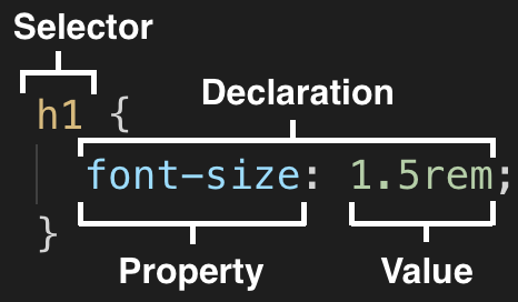
A CSS rule is made up of selectors, properties, and values.
- A selector describes which HTML elements to style
h1is the selector
- A property is the specific style to apply
font-sizeis the property
- A value is the value for the property
1.5remis the value
- A declaration is the combination of the property and value
font-size: 1.5rem;is the declaration
- A rule is the combination of the selector and its declarations
h1 { font-size: 1.5rem; }is the rule
All together, let's review the basic syntax in the following example.
Which parts are the rules, selectors, properties, values, and declarations?
h1,
h2,
h3,
h4,
h5,
h6,
p {
  color: #333;
  margin-bottom: 2rem;
}

.box {
  border: 1px solid #333;
}
Common CSS properties
A typical web page contains text structured into headings and paragraphs. We can use CSS to modify the styling of text. Some common CSS properties are shown in the following example:
body {
  font-family: Arial, serif;
  font-size: 1rem;
  font-weight: normal;
  line-height: 1.5;
  background-color: white;
  color: black;
}
Paired Programming Exercise
In the Bikes for Refugees project, work in pairs to make the Donate Now and Donate a bike today
buttons on the page an orange-red #c05326 colour, and make the Volunteer button white #fff
with orange-red #c05326 text. Leave the border for now.
CSS Units
When we measure objects in real life we might use centimeters or inches. CSS also uses measurement units like these.
There are two types of units: absolute and relative units.
- Absolute units represent the same size regardless of the size of parent HTML elements or of the viewport (i.e. the visible area of the browser).
- Relative units are based on the size of something else, such as of parent HTML elements or of the viewport.
The following table contains some of the most commonly used CSS units.
| Unit | Name | Relative or absolute | Description |
|---|---|---|---|
px | pixel | Absolute | This used to refer to real physical pixels on screens, but on modern devices with high resolution displays one CSS pixel is usually rendered using a whole multiple of real pixels. |
rem | rem | Relative | 1rem is equal to the font size of the root element. If the root font size is 16px, then 1rem = 16px and 0.5rem = 8px |
em | em | Relative | 1em is equal to the font size of the parent element. If the parent font size is 16px, then 1em = 16px and 0.5em = 8px |
% | percent | Relative | 100% is equal to the full width or height of the parent element |
The following code example shows how these units are typically used.
body {
  font-size: 16px;
}

h1 {
  font-size: 2rem;
}

h2 {
  font-size: 1.5rem;
}

.sidebar {
  padding: 1rem;
  width: 25%;
}
If you want to view all CSS units, visit the MDN CSS values and units page.
All together, let's review what each of the values in the previous code example mean.
CSS Selectors
We target or select HTML elements with CSS Selectors. The selector comes before the ruleset.
- Exercise
- Clues
Go around the room and name a selector each until you run out.
| Selector | Example | Description |
|---|---|---|
| Class selector | .text { } | Selects all HTML elements with class class="text" |
| Type selector | p { } | Selects all p HTML elements |
| ID selector | #text { } | Selects all HTML elements with ID id="text" |
| Descendant combinator | article p | Selects all p HTML elements that are a descendant of an article element |
| Child combinator | article > p | Selects all p HTML elements that are a direct child of an article element |
| Pseudo-class selector | p:hover { } | Selects all p HTML elements that have a mouse hovering on them |
To view all CSS selectors, visit the MDN CSS selectors page.
There are many selectors, but professionals typically avoid using type, ID, and combinators, as well as the style attribute.
Paired Programming Exercise
In the Bikes for Refugees project, work in pairs and use pseudo classes to make the background color of all buttons change to the darker colour #934423 when in a "hover" and "focus" state.
Test that it works by hovering over all buttons with your mouse, and by using the Tab key to focus on each button.
CSS Box Model
In CSS, everything is a box. An image is a box. A link is a box. The following diagram shows what the box model looks like.

The content is the text or image and it has a border. Inside the border there is space called padding, and outside the border there is space called margin.
We can modify these properties using CSS like in the following example.
.content {
  border-width: 1px;
  border-style: solid;
  border-color: black;

  margin-top: 1rem;
  margin-right: 1rem;
  margin-bottom: 1rem;
  margin-left: 1rem;

  padding-top: 0.5rem;
  padding-right: 1rem;
  padding-bottom: 0.5rem;
  padding-left: 1rem;
}
Instead of typing out each property, we can use shorthand properties for border, margin, and padding so we can make the code more concise.
.content {
  /* width | style | color */
  border: 1px solid black;

  /* Apply to all four sides */
  margin: 1rem;
  padding: 1rem;

  /* vertical | horizontal */
  margin: 0.5rem 1rem;
  padding: 0.5rem 1rem;

  /* top | right | bottom | left */
  margin: 1rem 0.5rem 2rem 0.25rem;
  padding: 1rem 0.5rem 2rem 0.25rem;
}
We can also modify the width and height of the content like in the following example.
.square {
  height: 10rem;
  width: 10rem;
}
In the Bikes for Refugees project, work in pairs and:
- Use the
paddingproperty to add some more horizontal space inside the navigation links in the header. - Use the
paddingproperty to add more space inside all buttons. - Use the
borderproperty to remove the border from all buttons. - For bonus points, you can use the
border-radiusproperty to make the corners of the buttons rounded.
Block and Inline Boxes
We can think of CSS as having two types of boxes: block boxes and inline boxes.
- Block boxes take up the whole width of its container and stack on top of each other vertically.
- Inline boxes are only as wide as its content and flow next to each other horizontally. In other words they go along in a line.
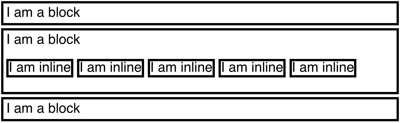
Block and inline boxes have a few more differences, which if you're not aware of can make it difficult to understand why inline elements are not being styled as expected. The following table describes the differences between the two in more detail.
| Block | Inline | |
|---|---|---|
| Does it start on a new line? | Yes, block elements start on a new line | No, inline elements continue on the same line |
| Does it take up the full width? | Yes, block elements extend to take up the full width | No, inline elements are only as wide as its content |
How does width and height work? | They work as expected for block elements | They do not work for inline elements |
How does padding, margin, and border work? | They work as expected for block elements, and push other boxes away | Horizontal padding, margin, and border work as expected, and push other boxes away. Vertical padding, margin, and border work as expected but do not push other boxes away. |
HTML elements are either block or inline elements.
| Common block elements | Common inline elements |
|---|---|
h1 to h6 | a |
p | img |
ul, ol and li | button |
form | input and select |
table | label |
article and section | strong |
div | span |
To change the type of box, we can use the display CSS property like in the following example.
/* Change the inline `img` element into a block */
img {
  display: block;
}

/* Change the block `li` element into an inline */
li {
  display: inline;
}
If you want to view a list of all block and inline elements, visit the MDN block-level elements page and MDN inline-level elements page.
CSS Inheritance, Cascade and Specificity
In CSS, you can write many rules including ones that conflict with one another. How does CSS know when to apply rules and when to override them? It uses the concepts of inheritance, cascade, and specificity to figure it out.
Inheritance
Inheritance is where a CSS property is inherited by child elements.
Some properties that are inherited are font, color, and line-height.
This means we can set the color of text for the body as pink and all its descendent elements will have pink text.
/* All descendent elements of `body` will have pink text because of inheritance */
body {
  color: pink;
}
Cascade
In CSS, the stylesheets cascade which means that the order of the CSS rules matter. If we have two CSS rules that target the same element, then the one that comes last in the stylesheet is used.
p {
  color: red;
}

/* Since this rule comes last, the `p` element will be blue and not red because of cascade */
p {
  color: blue;
}
Specificity
Specificity is how CSS figures out which rule to use when different selectors are used for the same element. Selectors have different 'weights'. A rule with an ID selector is typically chosen over one with a class selector, which is typically chosen over one with a type selector.
/* An ID selector has the highest specificity of these three rules, so the paragraph is orange */
#paragraph {
  color: orange;
}

/* Even though this rule comes after, the paragraph is not yellow because the ID selector has higher specificity */
.paragraph {
  color: yellow;
}

/* Even though this rule comes after, the paragraph is not green because the ID selector has higher specificity */
p {
  color: green;
}
To read more about inheritance, cascade and specificity, visit the MDN Cascade and inheritance page.
Flexbox
Flexbox is a name for a set of CSS layout rules for laying out items in rows or columns. They allow you to apply rules to elements to place them side-by-side and re-arrange them. You just specify how you want your elements arranged and the browser will scale this arrangement depending on the screen size and device used for viewing.
To add flexbox:
- Identify the elements you want to arrange in a certain way. For example, these three buttons:
<button>Home</button>
<button>Gallery</button>
<button>Contact</button> - Make sure they're part of the same container:
<div class="menu">
  <button>Home</button>
  <button>Gallery</button>
  <button>Contact</button>
</div> - Tell the container to use Flexbox to arrange all its children:
.menu {
  display: flex;
}
Once you have flexbox applied to the container you can start adding more rules to tell it exactly how the elements should be arranged.
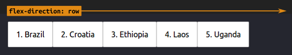
Display elements in a row
Use flex-direction: row to display the child elements in a row.
.menu {
  display: flex;
  flex-direction: row;
}
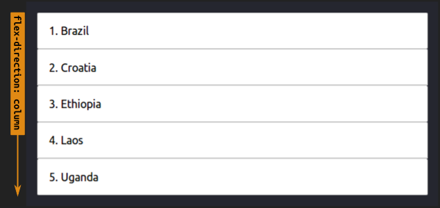
Display elements in a column
Use flex-direction: column to display the child elements in a column.
.menu {
  display: flex;
  flex-direction: column;
}
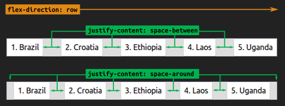
Space out elements equally in a row
Use justify-content: space-between to space out elements equally.
This can be used when the elements are displayed in a row:
.menu {
  display: flex;
  flex-direction: row;
  justify-content: space-between; /* or space-around */
}
Space out elements equally in a column
This can be used when the elements are displayed in a column:
.menu {
  display: flex;
  flex-direction: row;
  justify-content: space-between; /* or space-around */
}
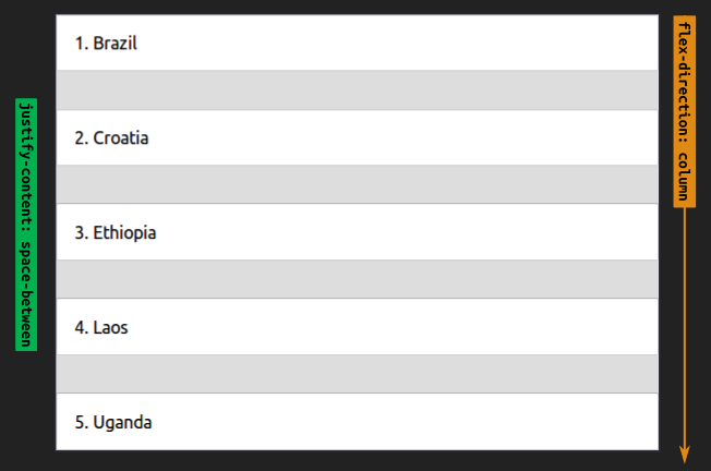
In the above 2 examples we used the same rule justify-content: space-between, but we changed flex-direction from row to column.
Notice how justify-content works in the same direction as flex-direction.
In the images above, the green arrow for justify-content is operating in the same direction as flex-direction.
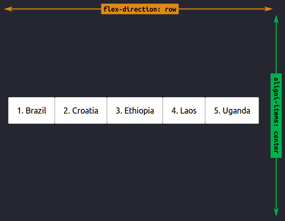
Align elements in a row
Use align-items: center to align the child elements in the centre.
This can be used when the elements are displayed in a row:
.menu {
  display: flex;
  flex-direction: row;
  align-items: center;
}
Align elements in a column
This can be used when the elements are displayed in a column:
.menu {
  display: flex;
  flex-direction: column;
  align-items: center;
}
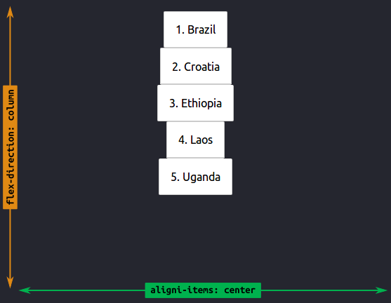
While justify-content works in the same direction as flex-direction, align-items works the opposite way!
Have a close look at the above images—the green arrow is opposite to the yellow flex-direction one.
If you want to view all flexbox rules, visit the A Guide To Flexbox article.
Continue editing the "Bike for refugees" website by adding 3 boxes below Jumbotron, and using Flexbox, make sure they are arranged like in the sketch below:
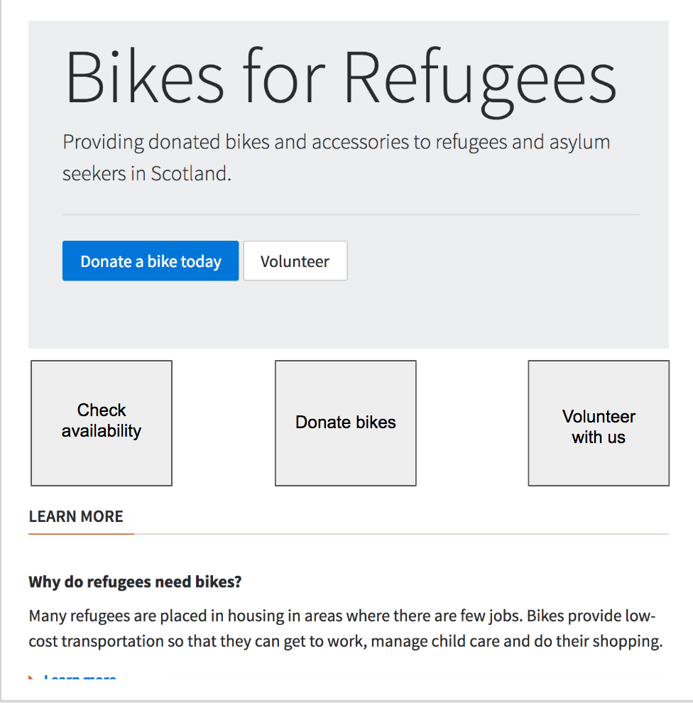
You can start with something like the below, by just adding a container, and the 3 text pieces within it. Try to use flexbox to position the text elements within the container to match the picture:
<div>
  <!-- CONTAINER START -->
  <div>Check availability</div>
  <div>Donate bikes</div>
  <div>Volunteer with us</div>
</div>
<!-- CONTAINER END -->
Once that's done you can move on to creating boxes for each individual text piece, and again, using flexbox to position the text piece in the middle of its box.
Let's take a break from flexbox for a minute. Do you remember the :first-child pseudo class? There's a :last-child pseudo class as well.
See if you can use these pseudo classes to give the left box a grey background (#ddd) and the right box a grey border (1px solid #ddd).
PD (Developer communication)
Session objective: In this section we'll explore how a professional developer uses technical language to communicate to different audiences.
Exercise objective: To explain concepts to different audiences
In small groups. Prepare a 3 min tutorial based on what you have learned so far. Address one of the three different audiences:
- A group of 10 year olds
- Your boss
- A peer group at a similar level to you
The tutorial should explain the following:
- Why is it important to build accessible websites?
- What is an HTML tag?
- What is semantic HTML?
- What is the CSS box model?
Exercise objective: To practice public speaking skills
Volunteer to present back to the class.
Exercise objective: To reflect on tasks and identify strengths
Reflect on what you found challenging and share one positive feedback to the wider group.
Coursework
Visit the Coursework page to view the coursework for this lesson.
Further Learning
- If you want to learn about
box-sizingand why the default is changed for many websites, read this CSS Tricks article. - If you want to learn how to add a title and favicon to a webpage, visit the MDN Metadata in HTML page.
Feedback
Please spend two minutes reviewing this lesson to help us improve it for the future. This feedback will be shared with volunteers.